You Probably Didn't Know These 5 Major 2018 Trends Happening Strong in Both The USA & EUROPE

Salut Les Filles! (Hello Ladies) and Gents
Super excited here to share my first official blog post. Bear with me, because when I start talking design—I can get a little geeky!!! If it gets too much, skip to enjoy the design inspiration. I like to get detailed when talking about design, because I want to educate my audience! Hope you enjoy!
So, I thought what better way to start out than to tackle the topic of Design trends; which are both strong in Europe and in the USA right now! I think we all can safely say that we are not surprised that interior design is expressed differently coming from diverse cultures. I, myself have discovered just how deep the outcomes can be just from one’s design aesthetics, ideas and even color. Typically, Europe is very bold with their design concepts and sometimes it may take a bit for those living in North America to embrace it.
Today, I am excited to share what statement designs are shared on both sides of the pond. Ahhh trends, yes! They come and then they go. I just love how Karl Lagerfeld once said, "Trendy is the last stage before tacky." So why do we follow them in interior design? Well, here is the simple answer to that: color trends are shifting towards how we feel as a society and where we are going. These are the trends that are here to stay for a longer period, because it reflects what is going on around us. Case in point: in the 90’s, as the U.S. was coming out of recession, there was a huge influx of color and we saw a lot of reds, oranges and pinks which represent a lot of energy and positive thinking as a nation. Let’s fast forward to now and where are we at?
THEME "COMFORT ZONE"
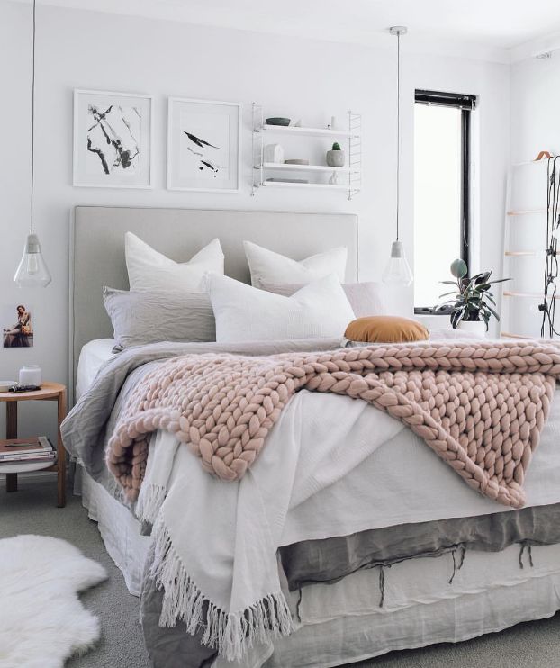
After visiting the “Maison et Object” show in Paris this past September—the biggest topic; even coming from the US, was all about comfort and sensuality. It was a topic about emotional connection in the home and having more of a feminine touch even for men. Being so connected; even more than ever to technology and working longer days, we as a society are wanting to unwind and we are looking for our home to be an oasis—a place to disconnect. Therefore, you will be seeing more and more furniture pieces with enveloping curves in pill and capsule forms, circles in chandeliers and end tables, as well as, soft pastels and greens this year. All this is ideas of ‘balance.’
VIDEO FROM MAISON ET OBJECT SHOW

VELVET
Velvet was introduced back in early 2017, if not earlier, and it is growing ever more popular. It was once considered a “winter-only” fabric. However, now velvet is being used year-round. We are seeing it being used in many assorted colors; on sofas, puffs, accent chairs and pillows.
Here’s some ways you can bring in velvet in your home:
SOFA AND/OR ACCENT CHAIRS: A design I can live with it! Going velvet on both accent and sofa is a beautiful combination. If you go with colors that are complementary and you want this to be the “show piece,” then make sure to have everything else be light and bright.
SOFA ATTENTION
Need a statement sofa with some cheerful vibes? This is the way to go!
(source: Ali Cayne)
ACCENT PILLOWS/THROWS
If doing velvet on bigger pieces sends shivers down your spine, then you can always put velvet on accent pillows and throws to spruce up your living area or your bedroom.

Source: Jonas Ingerstedt photography

Source: Blog

TEXTURE & LIGHTER TONE WOOD
Artisan texture is the perfect touch to any space and has definitely made its mark this year. I am all about that tactile love! Texture is vital in design—it’s not a new thing, so rest assure it’s not going anywhere! With that said, we’re seeing more natural, handmade feel woods: raw and embellished texture used in many objects, such as pillows, wicker lighting pendants and furniture pieces etc. Anytime I am designing a room I look for materials that will add the right amount of layering to create balance and depth to a space. Especially when designing a monochromatic environement, texture is highly used in order for the room not to fall flat!
This space below is a fitting example of layering texture in a monochromatic design. We have light woods and woven pendants and furniture.
Source: John Lewis Furnture
ACCESSORIES
Texture is being created in almost any objects you can think of. This is a well-balanced space where texture was added to help give the space some life with its white surroundings.

(source: Tiny Canal Cottage)
SINCE OF TRAVEL IN TEXTURE
Bringing in more texture with the sense of ethnic travels is huge as well. This has been around for a while, which is known more as bohemian style, however out of that is a fresh style called “Scandi-boho,” which takes from the clean and bright lines from the Scandinavian style—mixed with the bohemian textures, with a tweak of light layering. This is my kind of vibe!

Source: Green body + Green home
LAYERING WITH TEXTURE
Another example of clean lines with added texture to enhance layering in a monochromatic space.

Source : Studio Lifestyle

GREENERY
Man has an inherent need to be connected to ‘nature,’ so is this really a trend? Plants in the home have been a way of life for the Europeans already, so I am so happy this has been an influence for the rest of the world. Who doesn’t love clean air in the home! Plants are not just aesthetically pleasing but are also a major player in our wellbeing. There’s been countless environmental studies on how greenery increase productivity, happiness, relaxation and a sense of feeling at peace. If you are a design geek like me, here are a few benefits of indoor plants:
*Reduces Stress
* Reducing airborne dust levels *Keeping air temperatures down.
Tropical prints are big this season and are another trend, so adding tropical prints mixed with plants adds that extra greenery you need.
Source: The Register
DECORATING WITH PLANTS
If you’re looking for plants to be more of an accent piece instead of using it to show off the room—a nice floor plant with a few table plants will be just enough to give you that hint of greenery.

Source: AHOYTRADER
LESS CAN BE MORE
Even the Scandinavian bobo can enjoy a plant friend!

Source: Pinterest
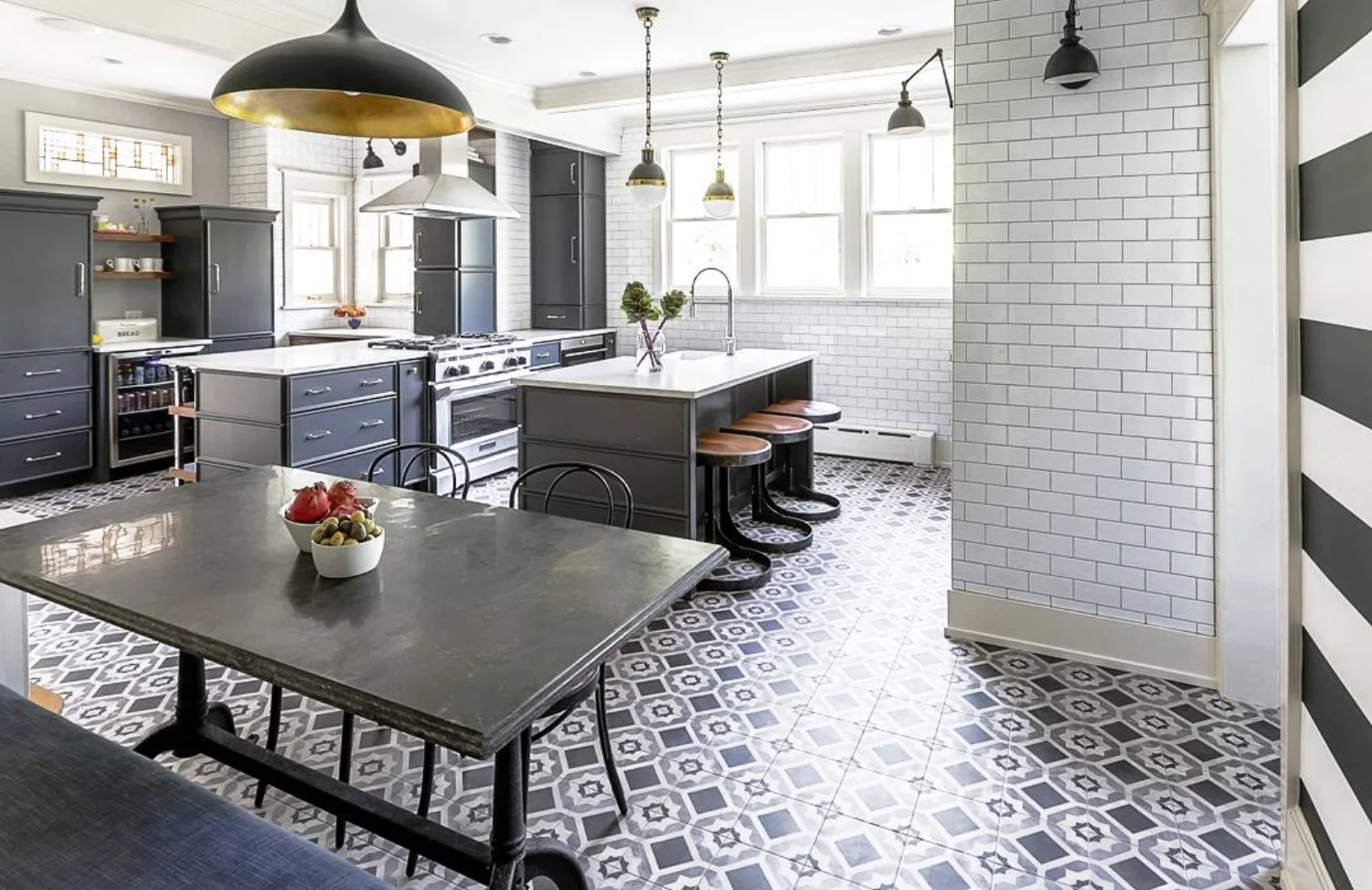
STATEMENT TILE
Another timeless design which has been around for centuries in Europe; especially in France, Italy and Spain is decorative floor tiles (motifs carreaux de ciment) . I designed my kitchen five years ago with an 18th century cement floor tiles as a back splash and it killed me to leave it behind! Such craftsmanship in these tiles. Well fast forward and now this is the crème de la crème of design. It has become more and more popular in the US. The style can range from classic to fun acoustic tiles. These tiles are great for utility rooms, kitchens and small bathrooms.
Here are a few examples from different countries:


VIETNAM

Source: Unknown

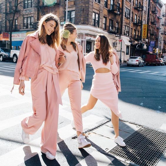
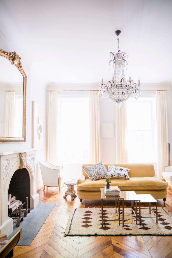
MILLENNIAL PINK/THE NEW NUETRAL
I could do one single blog about this trend! Stay tuned, because I’ll be back with a more detailed topic about this color. In the USA this is known as “millennial pink,” whereas in Europe—such as the UK, it is known as the new neutral color (Heart Wood). This pink trend comes in different hues ranging from warm (beige pink) to a blush pink shade. This goes back to what I mentioned earlier which is the movement of feminism; a soft and serene color palette. A trend that will not be going anywhere anytime soon. I can see this evolving much like how “gray” started to become the new neutral and beige was eventually phased out. It’s already hit hard in fashion, interiors and products across the board.
USA

UK

THE COOL KID OF PINK

Source: India Mahdavi